Our Team


Carlos Campbell

Aliquam bibendum, turpis eu mattis iaculis, ex lorem mollis sem, ut sollicitudin risus orci quis tellus.

Bonnie Smith

Integer tempus, elit in laoreet posuere, lectus neque blandit dui, et placerat urna diam mattis orci.

Gary Turner

Vivamus a ante congue, porta nunc nec, hendrerit turpis.

Emily Lee

Maecenas non leo laoreet, condimentum lorem nec, vulputate massa.

EVG on the go with iphone.jpg

 Evergage Mobile

MVP Mobile App

Project
The project was to create an MVP that satisfied the following three goals:
1. Quickly disable or publish a campaign
2. Check the health of the campaigns by viewing the campaigns statistics
3. Check the overall health of the website by viewing the reports dashboard for account with and without revenue tracking on their site.

The Company, Evergage, is a very robust web based personalization platform. The user creates campaigns which range from messages in the website, overlay, or manipulating the code.

The Team
The team was a lead engineer to build out the app, a junior product manager, and myself as the lead designer. I was responsible for all the design deliverables, including high to low fidelity mockups. As a group we collaborated on the user flows and requirements.

For this project, I included the four user flows that reach the main goals as well as my mockups and notes.


User flows

1. Disable a campaign

2. Check the health of the campaigns by viewing the campaigns statistics

3. Check the overall health of the website by viewing the reports dashboard (account with revenue tracking)

4. Check the overall health of the website by viewing the reports dashboard (account without revenue tracking)


Mockups & Notes

Design Challenge

Skills Demonstrated
Wireframing - Design Process - User Flows - Mobile Design - Rapid Prototyping

Prompt: Create a low-fidelity wireframe and simple user flow of a scheduling app for physical trainers that connects them to their clientele. Do not spend more than 3 hours.


My Solution

Goal: For trainers to be able to seamlessly schedule and connect with their clients

Feature/Product: Scheduling app 

Users: Physical trainers and clients

User Flows
1. First time use
2. Set up calendar (trainer only)
3. Schedule a session (client only)
4. Manage clients (trainer only)
5. Cancel or reschedule session

Key actions
1. Schedule session (client only)
2. Set schedule  (trainer only)
3. Settings for schedule (trainer only)
1. Set time zone for calendar
4. Cancel session
5. Reschedule session
6. Ability to modify calendar times
7. Notify or remind clients of sessions - is this automatic?

Questions 
1. What is the problem we are trying to solve with the scheduler?
2. How are we measuring the success?
3. Who are the clients, what are their goals, and how tech savvy are they? 
4. Who are the trainers, what are their goals, and how tech savvy are they?
5. What other functionality is needed?
6. What does this app look like on desktop vs mobile?
7. On average how many clients does a trainer have?
8. Can this sync with your personal calendars (google, outlook, etc)?
9. Are there different types of training sessions or different lengths of time?
10. How does price factor in?


User Flows

Client User Flow

Client User Flow

Trainer User Flow 1 of 2

Trainer User Flow 1 of 2

Trainer User Flow 2 of 2

Trainer User Flow 2 of 2

Research

Journey Mapping for Campaign System Redesign

Skill Highlighted
Journey Mapping - Collaboration - Teaching - User Interviews - User Research - Initiative - Organization & planning - Figma

The journey mapping project provided valuable insights for a major campaign system redesign which entailed a complete redesign of the current campaign editor and the addition of a template system that would drastically alter the user flows and the UI.

The purpose of these journey maps were to understand how the clients and their teams were using the campaign system and more specifically to provide an understanding of their process from start to finish, their pain points, what they enjoyed, who was involved, and how they collaborated with one another.

This research project had two parts which I will explain below. The work shared provides enough detail to demonstrate my skills, but are intentionally blurred to hide the sensitive information. I’d be happy to verbally elaborate on any appropriate information about the journeys.

The Journey Map Process

The Co-design

The project started as part of a two session co-design during the Evergage Personalization Summit, an event with clients, prospects, and partners. The co-design was an opportunity for our team to design with our clients and gain valuable feedback in person. The co design was split into two parts, the journey mapping exercise and a reporting feedback session.

The co-design originated as a side project. I took the initiative to research and propose the idea. Once it was approved, I had the opportunity to lead the project which entailed all the planning, updating the team, and collaborating with the team on important decisions. I facilitated the reporting session while the UX director facilitated the journey mapping exercise. As the project lead and team UX researcher, I prepared the UX director for the session which included training on facilitation, and making sure she felt comfortable. She did a fabulous job and worked with 5 of our major accounts to create the start of their journey maps. The session was a great start, but didn’t allow enough time to dive deep enough to provide all the information needed.

Deeper Dive

To fill in the missing information, I followed up with the 5 teams and conducted in depth user interviews. The interviews were a mix of video calls and in person meetings.

Digitizing the Journey Maps

I created the journey maps in Figma to provide a clean copy for the team.

A challenge was that we wanted to collect as much data as possible and each journey was drastically different. Each team had different components, team members, and tasks. This was also the first our team did journey mapping and we were setting the standard and styles for what this would look like.

Exposing Business Opportunity Through Data Visualization


Project:
Redesign the Segment Statistics Screen

Skills Highlighted
UI/Visual Design - Data Visualization - Startup Experience - Collaboration - Simplifying a Complex Problem - Axure RP


The Company, Evergage, is a customer data and personalization platform that by nature collects and stores data. A Segment is a group of users who are defined by specific rules or parameters such as location, revenue, and affinities that the Evergage user sets up in the platform.

The segment screen is crucial because it holds a ton of valuable info about the most important users of the platform and has the potential to expose opportunities to increase revenue, loyalty, and conversion rates.

For this project I’ll walk you through my process, explain my designs including my decisions and challenges, and share a retrospective of what I would have done differently and what I learned.

Current Screen

Redesign


The Process


Designs

In order to create the designs I had to deeply understand our clients’ businesses. We had to understand the above mentioned information.

Decisions

Challenges


Final Designs


Retrospective

This is a very crucial part of any project. Reflection helps strengthen your skills by acknowledging the knowledge you’ve gained and the lessons you’ve learned. It also allows you to understand what went well so you can use those aspects for future projects, and identify the areas of improvement.

Skills Strengthened and Gained

Startup Experience
At any given point during this project I was working on at least one other major feature design, a smaller design assignment, a team improvement project, and providing general design support. The pace was very fast and the projects constantly shifted. This called for excellent prioritization and organization.

Simplifying a Complex Problem
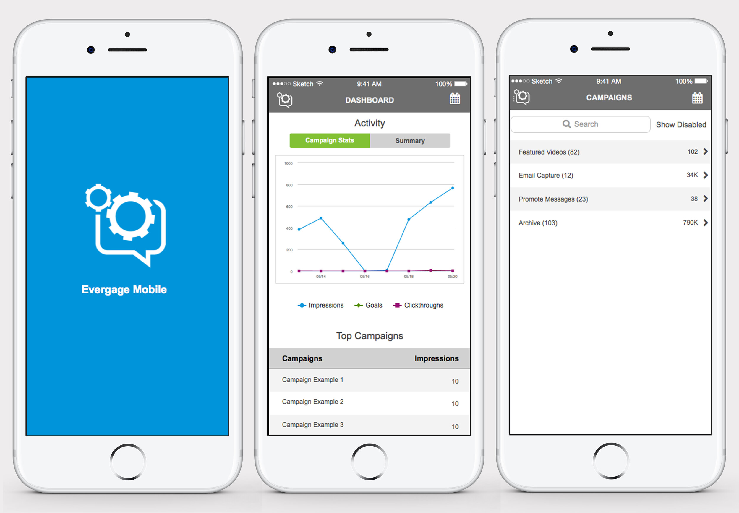
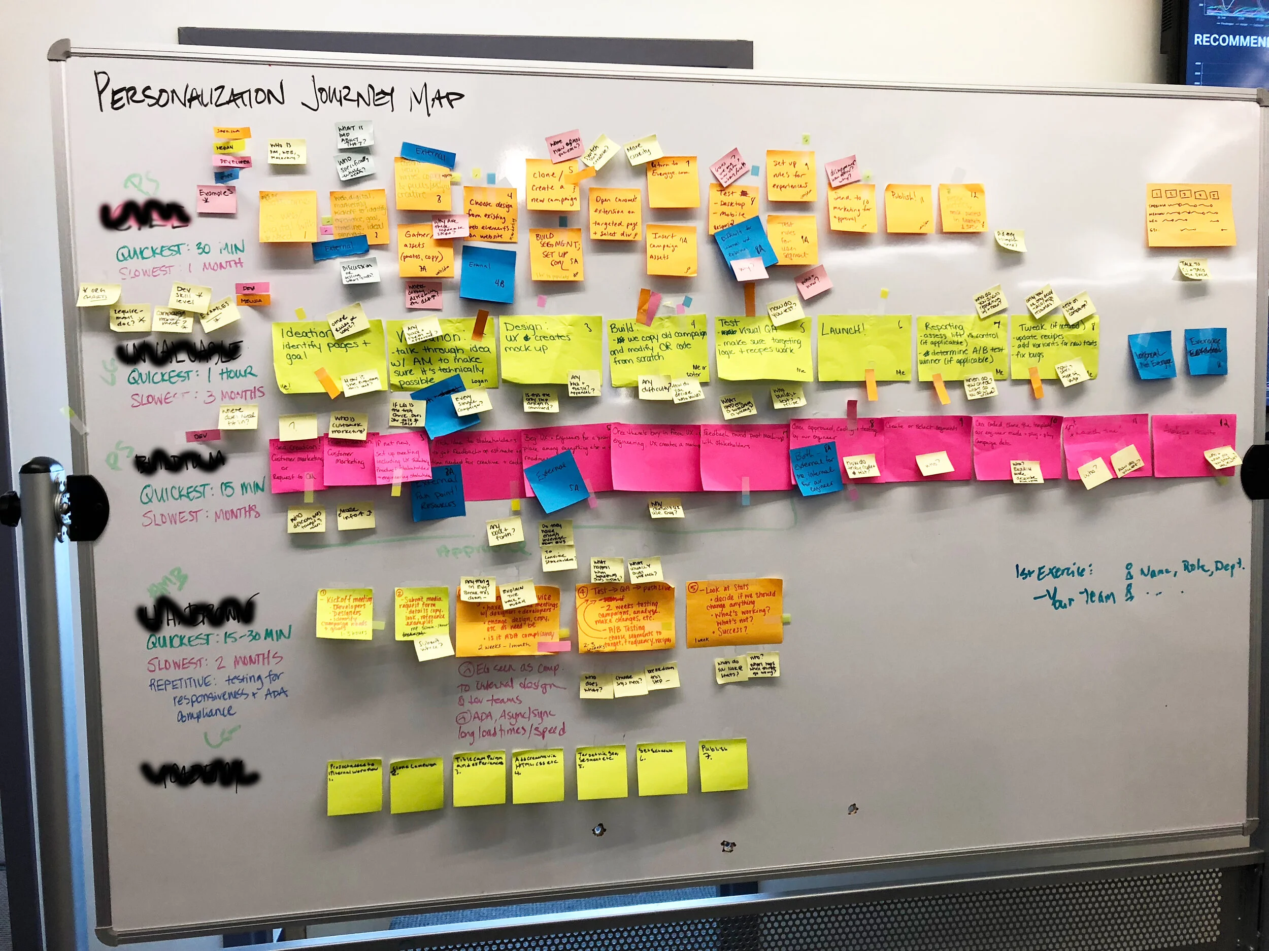
To better understand the complexities, I will explain in general what I was responsible to understand, the diverse client base, and the robust platform. I was on a small product team and needed to take on different tasks. In this situation, to design effectively I had to understand and sometimes collect a ton of different information including our clients’ business strategies and goals, Evergage’s evolving strategy and platform, and our growing user base and their goals. There were over 300 clients across many different industries, company sizes, team sizes, and maturity levels. Evergage displayed tons of data that was either collected or integrated. The design shows only a fraction of this data. The data from each card could have expanded and sliced in different ways to fill multiple screens. For example, we collect what we call “catalog” data that includes, purchase, view, add to cart data for each item, category, brand, and affinity. The machine learning was advanced, for example it knew that out of the number of visitors who purchased high heels, x visitors also purchased a dress and y visitors also purchased another pair of shoes. I had to gain a general understanding of all this data and the ways it could be sliced, how it could be used to find opportunities, and then apply that knowledge to the design. In addition, I had to understand the user’s and how they would interact with the design.

Data Visualization
This project reiterated the importance of simple design and the importance to know what your user’s goals. As I mentioned before, there was a ton of data that could have been added to this screen. It’s important to hone into the purpose of the task or feature. For this project there was a lot of cool ways we could splice and display the data to give insights into specific use cases. By sticking to the purpose of being helpful across use cases, this screen was kept as simple as possible. The challenge of simplifying that magnitude of data I strengthened my ability to prioritize data.

The data needs to be displayed in a way that is both visually appealing and comprehensive. As humans we enjoy designs visually pleasing to the eye yet we need to be able to interpret the data. To sum up the techniques I mentioned in my design decisions section, the use of white space, cards, simple colors, and icons can help with this balance.

I learned more about the different ways to visual data. Pie cards are optimal as “eye candy” because a person can’t accurately compare the parts to each other. Your mind can’t tell the differences between the sizes of the pie slices and easily compare. Histograms are best for showing frequency and large amounts of data. It can also help discover outliers and gaps. I used those to display the visit and purchase cadence.

Collaboration
Throughout the different stages of the project I worked closely with the CTO, the UX Director (my design counterpart, Lead Architect, the Customer Success Team(CS), the internal Retail Strategist, and the Marketing Team. For insights and feedback I scheduled and conducted numerous user interviews with CS team members and our internal Retail Strategist. On a regular basis to keep the team in the loop I presented the feature’s progress during the CS team’s reoccurring meetings. For time sensitive feedback, I communicated with the CS team through email. To strengthen the relationship between the UX team and the CS team I worked with specific CS team members and the CCO. Through their input, we improved the time sensitive feedback loop by creating an email template that was thorough and direct and setting the expectation that when this type of email came through it was urgent. At the end of the project, I presented the designs to the marketing team and stakeholders to get their very direct and blunt feedback.

What I Would Do Differently

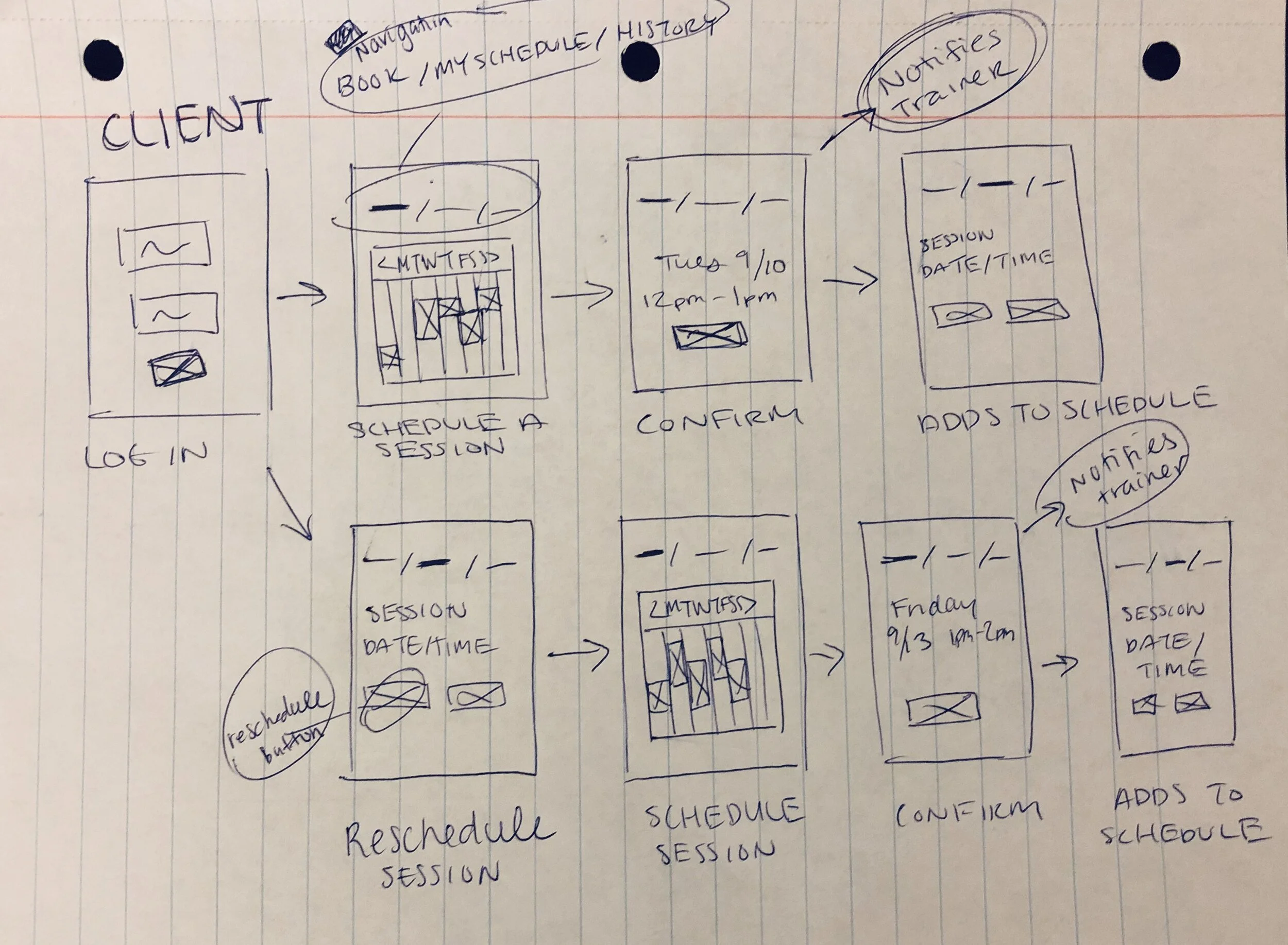
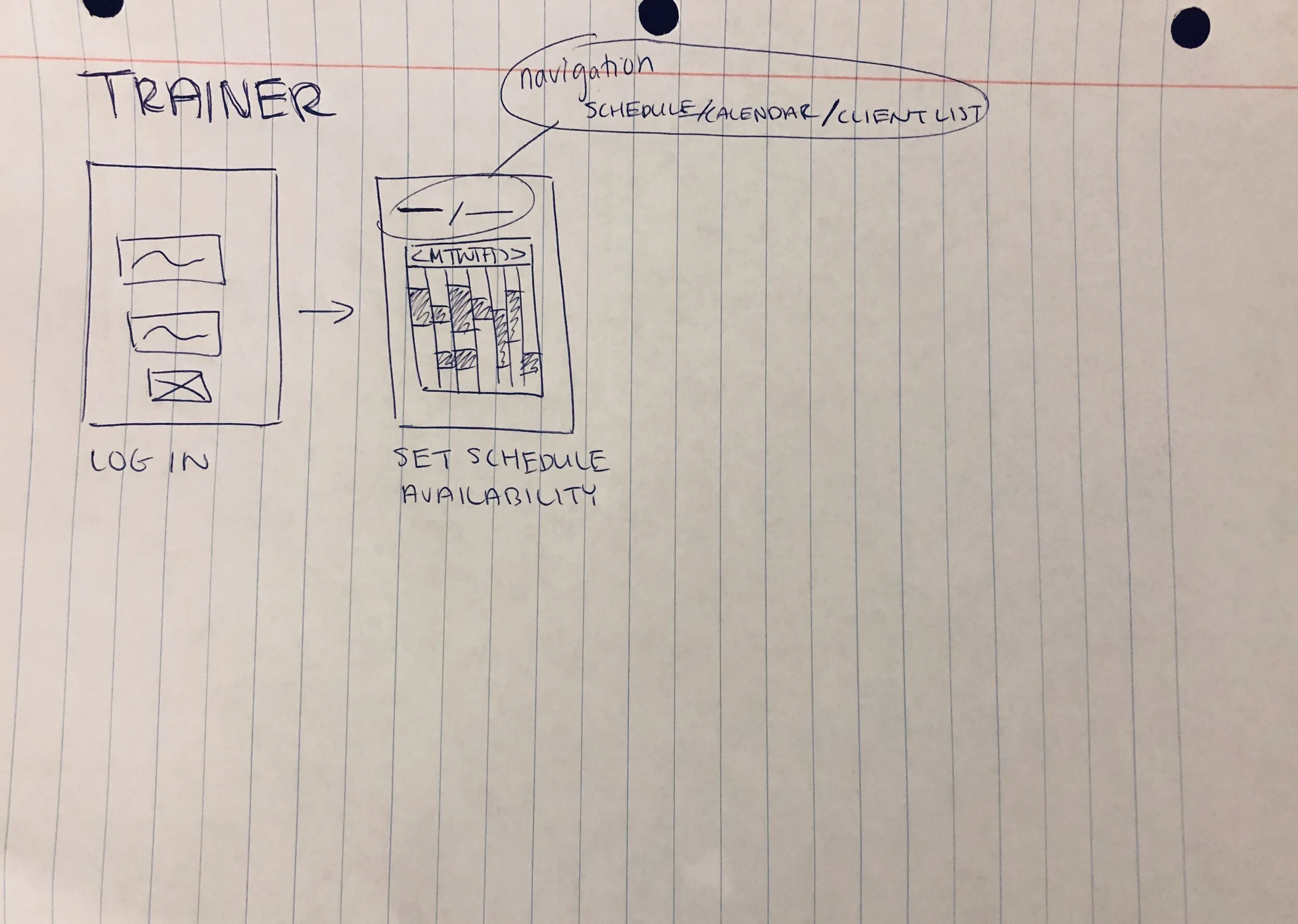
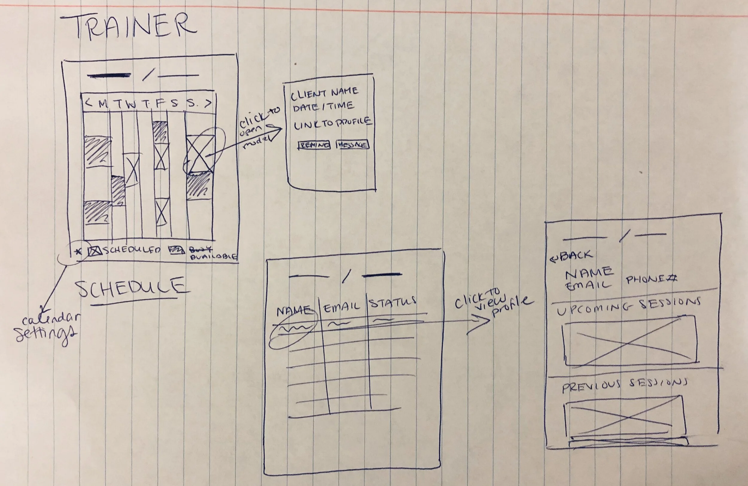
This screen has two levels, the first level is the segment statistics screen presented and the second levels are the drill down screens for specific pieces of data, for example a screen that shows all the actions completed not just the top actions. I would create three levels of this stats screen described below.

The first level would be a simple display of the most important metrics with the purpose of the user understand the health of the segment at a high level before diving in. The data would include revenue data (total revenue, RPU, conversion rate, purchase cadence, and purchased vs non purchases
percentage), visit data (total visits, average visits, average visit time, visit cadence, and new vs returning users percentage) and order data (total orders and AOV). The second level would be the segment statistics screen shown to give the user all of the context once they understood the important data. Another difference is that this would be customizable to let the user choose what is important to them so they can slice the data to give them the best information. The third level would be the drill downs to each of the individual sections to all the user to dive deeper to explore certain data points.

Recommendation “Recipe” Simulator Enhancement 

Evergage uses advanced Artificial Intelligence(AI), or machine learning for their recommendation system. The recommendations can be customized with a variety of settings, such as trending or similar items, or user affinities, or specific brands or categories through the creation of “recipes.” The recipes are added into our campaigns to personalize recommendations. Recipes must be tested to ensure they were set up properly and working correctly. The project was to dramatically enhance the functionality and improve the UI.

For this project I’ll highlight the two main changes and display the previous and new UI.


Changes

1. Enhanced User (visitor) Selection

In the old screen you selected a user (visitor) from a dropdown of all the users (visitors) of your website and it would output what products they would see if that recipe was used on them.

In the new screen, you can create a test group which is a group of users (visitors) that you can select based on a handful of affinities to ensure you’re selecting an optimal user. You can select a random user based on those parameters or a specific user (visitor) from your site.

2. Enhanced Recommendation Output

In the old screen (not shown) the results would output a word cloud of products, brand affinities, and category affinities for the one user selected.

In the new screen, for each user (visitor) the affinities are neatly presented with a bar graph of purchased vs viewed, and a display of products that is easily comparable to the other users.


Previous UI

Old+App+-+Test+Recipe+Screen.jpg

New UI

Campaign List Screen Redesign

This was part of a larger project, a platform UI and navigation redesign and restructure. This is a main screen in the platform and was one of the main screens to be redesigned. The platform redesign as well as this screen redesign was done to elevate the styles and UI, enhance the information architecture to organize the current features and allow for future scaling, and enhance usability for the different personas.

For this project I will display the previous and new UI, highlight five of the major changes, and display some of my notes and design drafts.


Previous UI

Old UI and Campaign List Screen

New UI

Traffic View

The Four Different Views

Main changes

1. Customized Views for Different Users
Change - Added a dropdown that changes the information in the rows to account for the different personas and types of accounts. The four view are traffic, goals, configuration, and conversions.
Reason - The campaign list screen is one of the most impactful screens in the platform because campaigns are the solutions that our clients implement to optimize their business. For instance, the technical campaign developer will use the configuration view because they need to find and create campaigns to build, QA, and troubleshoot, whereas the personalization manager will want to use this screen to compare stats across campaigns to determine their next steps. The different views allows the campaign list to stay in one location, yet be optimized for the different users and their goals.

2. Search Enhancements
Change - Removed the widgets that filtered the campaigns and added the functionality into a larger more robust search bar, which allows you to search for campaign type, name, state, last modified by, segment target, and folder name. Context, the Evergage dropdown filtered by the campaign type which meant an Evergage campaign or a specific third party campaign.
Reason - To help users more efficiently find and filter their campaigns, to improve the UI, and to allow for scaling.

3. UI Enhancements
Changes - There were several changes to make the interface look cleaner and simpler.
-Changed the folder and campaign list row styles from alternating white and gray to all white with a gray separating line.
-Changed the row headers changed to a gray with a subtle gradient and made the folder header the same style.
-Cleaned up spacing, including reducing the spacing between the icons and the edge of the row.
-Updated the filter icon (black down arrow) on the campaign list columns to show an ellipsis icon on hover.
-Changed the front from Arial to Helvetica
Reason - Overall to create a nicer UI for our users and so the clean styles matched the ability of the platform.

4. Collapsable Folders
Change - added the ability to collapse the folder
Reason - There is a ton of data and information available in the columns, this is allowing for more space to add more useful columns.

5. Details Panel Enhancement
Change - Moved the campaign details panel from the side to the bottom.
Reason -The main reason was to allow the user to see more columns and data about each campaign.

Notes & Design Drafts